(React) Storybook Driven Development
Introduction
In the hysterical world of web development, where technology is surpassed after just a few months of “hype”, React is an exception, having been on the crest of the wave for at least a couple of years.
Very often when we talk about React we take for granted a series of other technologies and tools that become indispensable where React is chosen to create Single Page Application.
In this context, the learning curve is anything but flat, and the development of a new feature typically consists of assembling several parts, related to different libraries, just to start “seeing something”.
This is the context where the use of a tool such as storybook can change the experience of the React developer
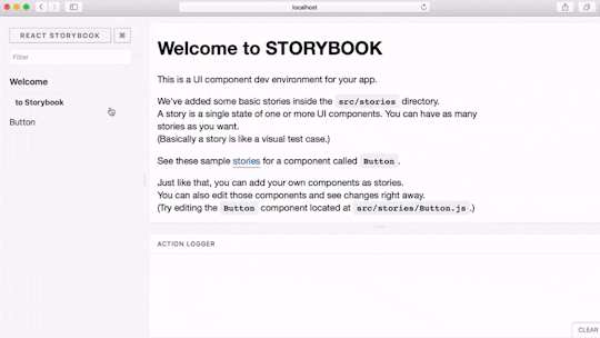
What is Storybook?
Within a web application, it is quite common to have many visual components, each with one or more states. The status of a component then often depends on a more global one (of the application or of a component higher up in the hierarchies).
Take for example a form with a submit button, which we suppose to be enabled only in the case in which the fields of a form are all filled in and validated. So every time we need to modify or test the submit button it will be necessary to reassess the form with sensible data, with obvious time-wasting.
It is also easier than you think to define the CSS style of the component with rules inherited from the parent component, in this case the form. And it is therefore just as easy to assume that our submit button will not be directly usable in another component, which we could hypothesise to be a search bar. At this point we are faced with a problem with two possible solutions:
- to correct the style problem and to test the component again both within the search bar and within the form, dedicating time to do so;
- to duplicate the original component, using a new one for the search bar and leaving the very time-consuming task of reunifying the components to better times (i.e. never).
A “manual” solution to this problem often used by more experienced frontend programmers was to create a showcase page of components (sometimes coinciding with the style guide of the application) to develop and test them in isolation.
Storybook resumes and formalises this concept, enabling rendering of the components that compose our application completely separately from it.
Installation and configuration
project of a start-up called kadira, Storybook has experienced a recent transition to a completely community-driven development after the start-up that initiated its development had to shut down.
Technically, Storybook is a webpack server that renders each story defined by the developer in a dedicated iframe. Whether you use it to develop a new component or only later to test it, rendering a component outside the normal hierarchy of the components that make up the application (and therefore the relative html and CSS) results in being able to easily identify alignments or properties dependent on rules defined by the father or by an ancestor.
Storybook is compatible with React and React Native and the official roadmap provides porting to other major frameworks for the development of SPAs such as Angular, Vue, etc.
Storybook is distributed on npm in multiple packages, including a command line interface that can be installed globally to automatically configure it for your project. But even for those persons who do not like to install npm packages globally, configuring Storybook is very simple.
After installing the main package for React with:
npm i --save-dev @storybook/reactwe will be presented with an executable file called start-storybook that we will typically add to the package scripts of the package.json such as:
"storybook": "start-storybook -p 9001 -c .storybook"in which .storybook is the directory where Storybook will search for its configuration and 9001 is the port on which the webpack server will run. It is therefore possible and even advisable to run Storybook on a port other than that of the actual application so that it is possible to launch both servers at the same time, thus avoiding wasted time due to the bundle generation phase with webpack not being particularly immediate.
At this point, all we have to do is to define the configuration file .storybook/config.js in this way:
import { configure } from '@storybook/react';

function loadStories() {
  require('../src/stories/index.js');
}

configure(loadStories, module);
and to launch Storybook with npm run storybook.
Defining stories
Suppose there is a component Button located in the directory src/components. In a typical Storybook configuration the stories could be loaded starting from the src/stories/index.js file (or from the one that was required in the configuration file) and a possible history of the Button could be defined as:
import React from 'react';
import { storiesOf } from '@storybook/react';
import Button from '../components/Button';

storiesOf('Button', module)
  .add('default', () => (
    <button>Hello Button</button>
  ));
Having given a pleasant name to a story, it can include more cases added with the add(, ) method.
This is particularly useful in the case of components in which appearance or behaviour varies from one state to another: for example, consider a table component that shows a list of users.
You will probably want to show a spinner in case these users haven’t yet been loaded. We could then define more stories for the component each with their own (static) data so that we can address the appearance and behaviour in each of them:
import React from 'react';
import { storiesOf } from '@storybook/react';
import UsersTable from '../components/UsersTable';

storiesOf('UsersTable', module)
  .add('default', () => {
    const users = [
      {name: 'Gianni', surname: 'Valdambrini'},
      {name: 'Mario', surname: 'Rossi'},
    ];
    return ;
  })
  .add('to be loaded', () => (
    return ;
  ));
Storybook Driven Development
As in any * Driven Development, the basic idea is very simple. A React application typically consists of React itself, a state manager (often Redux) and something that allows client-side routing (often react-router).
Creating the component after defining the routing rules, modifying the reducer appropriately and implementing at least the data load actions means writing a fair quantity of code “in the dark”, which we will be debugging all in one go.
It is clear that this situation is far from ideal: Storybook, however, allows us to define a story to render a component given certain properties even before integrating it with Redux and react-router (or similar tools).
As suggested also by the official documentation, the ideal approach to the development of a React component is to first create a static version of the component itself in which the data that the component expects is hard-coded in the code and only then to add dynamism. If the data hard-coded in the code is passed to the component via props, once in possession of the true data the component can remain (almost) unchanged, and it will be sufficient to replace the static data with the dynamic data.
This workflow fits perfectly with Storybook: a story will typically contain the static version of a component in which the hard-coded data passed to the component in the story will be that which defines its appearance and behaviour. Having defined what in Redux terms is often called “dumb” or “presentational” component it will be easy to integrate it with the rest of the app and with libraries such as the already mentioned Redux, react-router, etc.
Storybook: decorators and addons
Although at first glance what is offered by Storybook may seem absolutely sufficient for the development in isolation of the components, as the size of the application and therefore the number of components increases, it is not uncommon to be faced with certain problems (which we will soon be examining) or to want to simplify the code of the stories. From these experiences, decorators and addons were conceived.
Decorators
Decorators are React components that wrap a story and can be used for both “aesthetic” and functional reasons.
For example, a decorator could be used to include the content of a story in a container with a specific size and a certain background colour:
const CenterDecorator = (story) => (
  <div style={{
    width: 400,
    height: 300,
    backgroundColor: '#c0c0c0',
    display: 'flex',
    justifyContent: 'center',
    alignItems: 'center'}}>
    {story()}
  </div>
);
There are also a good number of very common libraries such as Redux, react-router or react-dnd which use the React context to provide global functionality. For example react-dnd requires that the application (or better, the part that uses drag&drop) is wrapped by an element called DragDropContextProvider.
In these situations, the only way to use the component outside the application is to define a decorator that is used to build the React element that provides the context to the application components. Therefore in the case of react-dnd it will be necessary to define a decorator thus created:
const DragDropDecorator = (story) => {
  return (

      {story()}

  );
};
Whether you define your own decorator or use an already defined one (for example host or storyrouter) the decorator can be applied to the individual story using the addDecorator function:
storiesOf('Button', module)
  .addDecorator(CenterDecorator)
  .add('default', () => (
    <button>Hello Button</button>
  ));
or similarly globally to all stories:
import { storiesOf, addDecorator } from '@storybook/react';
addDecorator(CenterDecorator);
Addons are React components that use Storybook as a platform to provide functionality integrated with the Storybook window itself.
Addons
Storybook has a good number of addons, of which the most common is the actions addon.
actions is a very simple addon that can be used to log actions/functions recalled by a component:
import { storiesOf } from '@storybook/react';
import { action } from '@storybook/addon-actions';

storiesOf('Button', module)
  .add('default view', () => (
    <button>
      Hello World!
    </button>
  ));
as you can guess from the code above action returns a function that can be passed wherever a function is expected as a callback. When the callback is called the addon will print, in the panel below the preview of the component, the name specified to the action followed by the topics passed to the function.
Another fairly commonly used addon is links, which allows the interlinking of actions. The operation is similar to that of the actions addon: once the linkTo function is imported it will be possible to construct a callback which, when invoked by the component, makes the history specified as a topic active: the logging of actions/functions called by a component:
import { storiesOf } from '@storybook/react'
import { linkTo } from '@storybook/addon-links'

storiesOf('Button', module)
  .add('First', () => (
    <button>Go to "Second"</button>
  ))
  .add('Second', () => (
    <button>Go to "First"</button>
  ));
Thanks to the use of links it is therefore possible to create demos or prototypes starting from a series of stories in a similar way to what is offered by tools such as Invision.
Storyshots
When we talk about testing applied to graphical interfaces we typically enter a slippery terrain, in which the well-intentioned aim of testing our application sometimes clashes with development and maintenance times for tests that are too extensive to be tackled in practice.
Even the React world is not without its problems: one of the most widespread solutions for unit-testing is to use enzyme and to perform shallow rendering to render our component, then making assertions about how much is rendered. The problem, in this case, is that being too scrupulous about what has been rendered makes it necessary to update the tests even in the case of non-significant changes, while only aiming to test the main aspects leaves the door open to problems which, although not of primary importance, are in any case undesirable to have in an app covered by tests.
Jest has recently introduced a new way of carrying out testing, called snapshot testing which is the basis of a special addon called Storyshots.
With test snapshots, the component is rendered in a way similar to how enzyme worked, but the programmer is not required to write any kind of assertion.
So how can these tests work?
The rendering of the component (or rather its description, which is simply a javascript object) is saved in a file, and the subsequent executions of the test will compare what is rendered with what was saved in the snapshot. When a test differs, a failure is reported and it will then be the responsibility of the developer to check whether the change made in the component was intentional or not. In the first case it will therefore be possible to update the snapshot, while in the second case it will be possible to correct the regression.
In this sense, test snapshots can be seen as warnings that aim to draw the developer’s attention to one or more components to say “this component has changed. Did you do it on purpose?”
Storyshots allows Jest to show stories as tests with which to perform the snapshot testing. There is no need to do anything specific when writing stories. All that is required is to configure Storyshots, creating a new file that it is customary to call storyshots.test.js within which to define:
import initStoryshots from '@storybook/addon-storyshots';
initStoryshots();
Conclusions
It is surprising how, by fully embracing the tool and developing according to the “Storybook Driven Design” style, the use of Storybook can simplify and therefore speed up the development of React applications.
Developing a component on Storybook and only subsequently integrating it with the application has the great benefit of practically eliminating the cost of story development. It should be emphasised that writing a story in most cases means passing properties to an imported component, a component that will then be included in the application where the real properties will be passed to it.
The additional quantity of code to be written is therefore absolutely reduced (basically limited to the hard-coded properties to be passed to the component), and thanks to decorators and addons, the duplication of “support” code is almost entirely eliminated.
Obviously Storybook is only a tool and as such it is fundamental that use that is made of it: if it is used only once the work in the app has been completed to verify that the components are well made, it is useful, but it becomes one more thing to do. If instead it is used right from the beginning of the development of new components adapting our work workflow to integrate it, it is then that the maximum benefit can be obtained without having a negative impact on the speed of development.
After a few months of uncertainty due to the disappointing outcome of the start-up that first brought its development forward, Storybook is now actively being developed and used by a number of big players such as airbnb, slack and cloudera. But, as always, seeing some examples of what can be done with a tool is a great source of inspiration:
Compatible with React and React Native, Storybook promises to become an even more widespread and popular tool as soon as the porting for two big players in the SPA world, namely Angular and Vue, is completed. But already today it is a widespread and popular tool, not by chance included in the official documentation of create react app, the new and “recommended” way to perform the set-up of React applications. All that remains is to try it out, and if what has been written so far is not enough, a short introductory video by the creator of Storybook will be able to dispel any remaining doubts.